
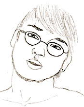
[this is a pic of my boyfriend in a dance he did recently. he was portraying the life of his choreographer and the girl is portraying the man's mother.]
roots
Most people will say that it is important pay homage to your roots. Things from your past affect things in your present and future, and it is common to say that you should let your past shine through. However, I think that most arguments along this line are stupid. I feel that, yes, everyone has a past, but it is more important to live in the present and think about the future. Not to say that pulling inspiration from the past is wrong or dumb, but sometimes dwelling on past events can hinder and more contemporary event.
With design, there are obvious patterns, styles and techniques. These were set in the past and are still implemented today.

[these are two ideas that i've had for the window installment project. my idea started out with simple, vertical lines and then developed into a combination of verticals and horizontals. . . i am still developing the idea even further.]
congruence
Congruence deals with how two or more items are related. In our design classes, our professors stress the development of our ideas into something beyond our initial inspirations. Every project we've worked on has been a distant extraction of the stories that we read at the beginning of the semester. In my French class I constantly try to relate things back to Spanish and Latin, which I have also studied, in hopes of being ale to better understand my teacher. These languages are all Romance languages and have many similarities. In this way, congruence relates directly with the idea of roots. Even when you have many differences with something, it is still possible to trace similarities back to something else.
Congruence deals with how two or more items are related. In our design classes, our professors stress the development of our ideas into something beyond our initial inspirations. Every project we've worked on has been a distant extraction of the stories that we read at the beginning of the semester. In my French class I constantly try to relate things back to Spanish and Latin, which I have also studied, in hopes of being ale to better understand my teacher. These languages are all Romance languages and have many similarities. In this way, congruence relates directly with the idea of roots. Even when you have many differences with something, it is still possible to trace similarities back to something else.

[this is a drawing i did while eating lunch at uva. the concept of the restaurant was to showcase artwork. the walls were a bright periwinkle color and made it a very light, inviting area.]
concept
The concept of a project can always change, even if in the final stages of development. But, it is nonetheless important to have a concept to a design in order to make sure the design is unified and makes sense. Working with the concept of manipulating light, I’ve had to think about different ways to do this. There is the option to let in as much light as possible, to filter it or to block it out entirely. With our most recent assignment, I have decided on the concept of private light. At this point, I plan to arrange slats across the window at my desk that, to anyone away from my desk, would appear to limit the amount of light that passes through them. However, once seated at my desk, if I were to look at the window treatment, the slats seem to disappear due to the angles at which I have set them. The overall concept of the project is to have unified window designs throughout the class. Therefore, my own concept might change to better match the flow of ideas through the studio.
The concept of a project can always change, even if in the final stages of development. But, it is nonetheless important to have a concept to a design in order to make sure the design is unified and makes sense. Working with the concept of manipulating light, I’ve had to think about different ways to do this. There is the option to let in as much light as possible, to filter it or to block it out entirely. With our most recent assignment, I have decided on the concept of private light. At this point, I plan to arrange slats across the window at my desk that, to anyone away from my desk, would appear to limit the amount of light that passes through them. However, once seated at my desk, if I were to look at the window treatment, the slats seem to disappear due to the angles at which I have set them. The overall concept of the project is to have unified window designs throughout the class. Therefore, my own concept might change to better match the flow of ideas through the studio.

[this is a view of the kitchen space that i designed recently. theoretically, i am using wood floors, stone work on the wall, granite counters, stainless steel and glass. the column is meant to be a light fixture.]
materiality
Material choice is a hugely important decision in design. It determines cost of the project, the aesthetic ‘temperature’, textures, colors, et al. Materials such as wood, ceramics and plush fabric often create a warm and cozy environment. Warm colors, like reds, oranges, etc., also help. Metals, slick fabrics, plastics and glasses can induce a cool, active mood. They are more reflective and bounce light through a space.
Another decision to make is whether or not to use local materials, or materials that would easily blend with the environment or immediate surroundings. Choosing a material that comes from the site makes it seem a part of the area and usually doesn’t stand out as a impediment to the eye. You can also use materials that compliment the surroundings with texture, color, scale, etc., which will make a design look fitting to the environment.

[this is a drawing i did on site at fallingwater. naturally speaking, there was an overwhelming amount of rhododendrons in the area that had a great presence in front of the house.]
compression : release
When we visited Monticello, the uses of compression and release were apparent in interior spaces versus the landscaping. Outside the structure are large lawns, wide paths and gardens and an amazing view of the horizon due to being on top of a hill. Inside the house, though, many rooms are small and tight. There are very narrow doorways and stairwells that can seem to make being in the space feel crowded.
More so, compression and release are the focus of Frank Lloyd Wright’s Fallingwaters. The mountain on which the house was built hugs the structure with its rocks, trees and other natural elements. The house has very strong horizontals that seem to bring the structure closer to the earth. Then, inside the house, visitors find themselves in a wide, open great room, flooded with natural light. Interestingly, Wright’s choice in uncommonly low ceilings create a cozy feeling, while keeping your focus at eyelevel and looking outward. The compression of the ceilings is reminiscent of a cave. The deeper you get into the house, the less natural light is incorporated, and therefore the spaces become more intimate. The overall celebration in Wright’s impeccable design is clearly the natural surroundings. Aided by the severe compression of the house, a grand sense of release is apparent when one goes from inside to out.
No comments:
Post a Comment