Blog Archive

Friday, March 27, 2009

Unit Summary: Alternatives

The Alternatives unit is all about taking the rules established in the foundations unit and bending them into new forms. These alterations take a very religious turn as a reflection of crusades and mixing of cultures. A great source of inspiration for Christian cathedral design came from the Hagia Sophia, a mosque in Istanbul. The Hagia Sophia is known for its massive dome and the great, highly decorated interior spaces.
Gothic architecture flourished in the high and late medieval times, after the Romanesque period. It is largely recognized for its pointed arches, ribbed vaults and flying buttresses. There was a great competition to build the tallest cathedrals with the most interior space and light. This was thought to bring the cathedrals closer to heaven, the ultimate goal.
The Renaissance was a revival of ancient Greek and Roman ideals. Emphasis was put on symmetry, proportion, geometry and the regularity of parts as they were used by the ancient designers.French Gothic Cathedral- Notre-Dame
Renaissance architecture
Villa and Palazzo
Villa-country home, escape for wealthy
Palladio incorporates temple forms onto residential structures
Palazzo-mixed business, entertainment and housing
Baroque- feeling of movement through curved lines-pushing and pulling

Wednesday, March 25, 2009

Grammer:Syntax

Audience, in design, refers to the intended viewer for whom the product was designed. Audiences can be put into many categories such as age, gender, family, mature, interest, subject, etc. For example, as school playground would have a very young audience where as a retirement home has a very old audience. Libraries are intended for a quiet, studious audience while a stadium is made for rowdy, cheering fans. Many public places are kept generic, such as medical offices as business places, to satisfy aesthetic needs of many types of people. Interestingly, the intended audience of an auditorium is an actual audience. In this type of space, seating is supplied in a way that the focus of the viewer is directed towards a stage or similar point. Abramovitz’ Lincoln Center in New York is home to the New York Philharmonic Orchestra. “From the ceiling, elongated hexagons were suspended as ‘acoustical clouds’ to disperse the sound to the audience (Roth, 82).”


However, there was a major flaw in Abramovitz’ design. “Among several problems, the sound was unevenly dispersed throughout the hall. Eventually, a number of important soloists and orchestras flatly refused to perform there (Roth, 82).” Thus, architect Philip Johnson and acoustical consultant Cyril Harris revised the design to make it more effective as a concert hall. Revisions are crucial if the first iteration of a design doesn’t fully realize its goal. Literally, a revision is a second attempt a realizing a vision. Many things go through revisions: constitutions, laws, term papers, movies, songs, buildings, etc. If it is found that the rules or ideas put into a product no longer apply or function, a revision is in order so as to replenish the usefulness of the product. It is like giving something a character uplift.


Character is what is unique about a design.

Friday, March 20, 2009

Project Outline

Things to be included:
Contour drawing of exterior in context> vellum with pen.
Drawings of exterior [2+] views and interior rooms [3+]> bond with pen, marker and colored pencil.


I. Background
A. Name and Year Built
B. Designer 
C. Location
D. Type of building

II. Details
A. Description of exterior and materials
B. Rooms and their functions
C. Size of building
D. Surroundings

III. Extra
A. About Designer


Questions and Comments:
I haven't found a floor plan of the building.

Monday, March 16, 2009

Thursday, March 5, 2009

New Precedent Analysis


Harvard Housing, LEED Gold
10 Akron Street, Cambridge, Massachusetts
Kyu Sung Woo

The challenge that Kyu Sung Woo was to design a residence that would house fifty percent of Harvard University’s graduate, professional and doctoral students. In doing this, stress would be lessoned on the local housing market and a stronger residential campus community would develop. Housing 215 beds, this residence building includes thirty different suite types, faculty director’s suite, a fitness room, study lounges, a multipurpose room, a garage, a courtyard and even a lakeside view.
For his design, Woo built a large, brick block that sits precariously on a smaller, wood-veneered base. The windows of the building are arranged in an irregular pattern, with many of them protruding from the surface.

Sources:
1
2
Photos by Timothy Hursley

Wednesday, March 4, 2009

Dinner from Memory

This is the dinner I ate at College Night at IHOP last Wednesday or Thursday. I was excited when we got this assignment because this was the first time I'd eaten dinner in over a week.

Creation Story Model


This is among my favorite pieces that I've made. The white, or light, is coming out of the black, or dark, just like in my story.

Positive and Negative Space


This is the final model that I made. The black acts as the negative space which seems to overpower the figure confined in the small amount of white, positive space.

Artifact Wall


These are views of the wall I made to support my artifact. Though my original artifact was a jacket, I transformed it into a waste basket for this project, giving it a more functional twist.

EUC Detail

This is a detail of the Minerva statue outside of the Elliot University Center. I felt that it was important to capture this as part of the EUC even if it is outside and not in.

Graphic for the Portal

For this I drew from a section of Old St. Peter's Basilica. I wanted to show positive and negative space.

Blind Contours


I really like these. Jon's head is a little flat, but I think they both turned out well.

Bedroom from Memory

[I've started working on my handwriting....it's improving!!!! Finally!!!!!

EUC details

Second story of the eating area.

View of atrium.

View of outer wall from lounge.

Steps from top floor.

Macro to Micro, words of the week


Porch, Court & Hearth

The Megaron

The idea of a porch, court and a heart was first mainstreamed by the ancient Greeks. On a Greek temple, a porch refers to the colonnade that surrounds the building. The court is the open area inside the porch and can carry on into the temple. The hearth of a Greek temple is where the main focus is. It is often more enclosed than other features and can house artifacts and sculptures to honor the patron gods and goddesses. In the case of the Grecian Megaron, “at the center of the principal room was a raised circular hearth, suggesting the room was open at the top (Roth 186)”. These features, of course, can translate into any subject of design. In my designs, specifically when drawing or illustrating, I like to think of my subject of the image as the hearth. It receives the most attention and gets the most detail. The court would be the negative space around the image, which is framed by the porch. With a drawing, the porch could be the framing technique that is used to showcase the item.


Composition
Church of Santa Maria
Drawing for a friend-requirements:Libra scales, hummingbirds and cherry blossoms.

Composition deals with how something is laid out and why. In the time of Gothic cathedrals, composition played a huge role in achieving the purpose and style of the buildings. Many cathedrals are designed in a cross shape. The dimensions used are taken from various lengths of each cathedral, thus giving the composition unified proportions. A cross–shaped composition means that the visitor must travel a lengthy bit, all the while taking in the heavenly splendor of the building, before they reach the hearth of the cathedral where the choir, apses, etc. are. Also, the composition often includes a dome where the four wings of the building meet. A dome was used to symbolize heaven enveloping the earth. Also, “light is a most effective element in … the creation of shrines and religious buildings (Roth 74).” In the church of Santa Maria della Vitoria in Rome, “the action is lit by a window hidden behind… the stage…. Everything else in the chapel is dimly lit, so that one’s eye is automatically drawn to that brightest spot in the entire composition (Roth 74).”
It is important to think of the context of a design when developing an affective composition. For instance, I have been creating several artifacts as of late dealing with black and white materials. To make a good composition with these factors, I have had to create a sense of balance and harmony between these two contrasting aspects.


Diagram
Map of UNCG
Diagram of a [dance] Studio Floor

Diagrams aid in explaining and expressing features of a space that can’t always openly be observed. They often show “ the relative components of function in different building types (Roth xiii).” Throughout campus, we have been working to diagram aspects of several important buildings. Personally, I have been working with the Elliot University Center. To diagram this, my group has looked at the context of the location, the function of the building, the circulation throughout is and the designers’ intent in the design of the building. The EUC is intended to be a place utilized by students to eat, shop, relax and enjoy fine arts. Our diagrams show the different zones within the building, as well as surrounding features and walking patterns. Also, it is important to include accurate floor plans of a building to portray accurate proportions of what the different functions are of the space and so that the viewer can see how the different features interact.


Impression
Cathedral
Flying buttresses of Amiens

Impressions are key to design. They determine how a viewer perceives your work. Also, by repeating elements and ideas taken from preexisting sources, a particular style can become apparent throughout a region. Gothic, Romanesque, Renaissance…these styles are achieved by taking from the impressions cast by other artifacts. For instance, “Renaissance architecture sought clearly expressed numerical relationships in their designs(Roth 359).” In fact, they made, “columns so proportional that they were spaced exactly as far apart as they are tall (Roth 362).”
For me, it is crucial to think about the impressions my work will give when shown. It is important to maintain a level of originality, effort and craftsmanship in the things I create in order to be taken seriously as a designer. This is true of all designers as well as someone in any career.
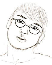


Detail
Ionic Column
Detail of Omelet

The details of a design are what make it interesting, unique and desirable. Sometimes, it is important to recreate an artifact. If this is the case, a designer must pay meticulous attention to the details of the original in order to be fully credible. Designers von Klenze and Schinkel followed the designs of ancient Greeks and Romans. “They can be called Revivalist because of the fidelity to Greek and Roman source material in their details (Roth 425).”

In conclusion, it is important to think when designing. Is this what I intended it to look like? Is my idea clear? Is there enough? First off, it is necessary to develop a good composition before you try to make something, even if it takes more than one try. If you don't think that your creation fully gets the point across as well as you want, make diagrams available to the viewer to explain different aspects of the piece to help them understand it better. In the diagrams, and more importantly in the actual piece, pay attention to the micro-scale and add details to better personalize the piece. This helps with the overall impression that a viewer gains, whether good or bad. Finally, keep in mind the context of the image or object you are creating. With a picture, consider matting and framing it to define boundaries and make the picture pop. In a space, create boundaries and zones using things like landscaping, colors, textures, lighting, furniture, walls, etc.

Sunday, March 1, 2009

Junctions: Foundations Unit

Junctions can be found in every lesson of the Foundations Unit. A junction is a meeting of two or more ideas that combine into one. With design it can apply to a multitude of things: man verses animal, architecture verses nature, light verses shadow, natural verses synthetic, etc. In architectural history, the most common junction is of one culture borrowing from the ideas, styles and technologies of past cultures. These joinings can be smooth and seamless or can contrast.
The ancient Romans were the masters of borrowing from other civilizations. They did not try to hide their Greek columns, even their gods and goddesses, nor their Egyptian obelisks. Columns that the Greeks evolved and perfected and used for structural support were used by the Romans as pilasters adorning the facades of their buildings. The Romans also erected massive, freestanding columns, an idea from the Egyptians, as symbols of masculinity, victory and pride. Also like the Egyptians, they would carve images into their stonework to illustrate stories of war and triumph of the benefactor.

Roman & Egyptian Column
Also, Romans were very imposing upon the landscape. Unlike the Greeks, who would build with the topography of the site, Romans would cut out and level and build up the site until it was like they wanted. For example, a Greek designer would build an amphitheater on a hill, where the slope of the land would serve as the basis for seating. Romans, however, as shown in the Coliseum, was built without regards to the terrain.
Other junctions can also be found within design, such as the decision to use local or foreign materials. In Egyptian architecture, buildings were predominately made out of the very sandstone of which their landscape was made. This is a practice that makes some things easier, such as traveling expense and labor. Using local goods help to blend architecture into the landscape and make it seem like it fits its environment. Greeks and Romans also used materials that were more readily available. But, as was the case in the creation of Stonehenge, some designers choose materials that are not local. The stones used for it came from a location very far from the site. This decision not only preserves the local landscape from mutilation, but it makes the structure stand out from the architecture.

Classical Orders
One thing that the Romans did to make an idea their own was to put their own style into it. Their use of columns was often more ornamental unlike the Greeks who used them for load bearing properties. Also, Romans first developed arches, domes and concrete. These three components made everything that they were used in unique. Arches opened up a huge new venue of possibilities to the world. Concrete allowed a brand new surface treatment to be used on buildings which could be molded into any shape and would offer great support.
Junctions, overall, are more common than people may think. It is very important to learn from other peoples’ designs, technologies and artifacts. You never know what you might be able to use of theirs if you can put your own spin on it to make it functional for your visions.

Foundations Unit Sumary

The Foundations Unit largely focused on the similarities and differences between the ancient Egyptian, Greek and Roman civilizations in regards to their ideas and methods of design. According to Sir Henry Wotton, the basis of design is that, “in architecture, as in all operative arts, the end must direct the operation. The end is to build well. [Building well has] three conditions: commodity, firmness and delight.” The ideas of commodity, firmness and delight play a role in all forms of design and they can be found within all successful artifacts from the ancient times to the present.

Commodity determines the function of an artifact. “A thing must answer its purpose in every way- that is, fulfill its function in a practical sense… (Gropius).” Whether the function of a space is intended for religious ceremonies, offices, performance arts, relaxation, etc, the function must be met entirely.

Firmness is synonymous with strength, stability and longevity. Structures such as the Pyramids at Giza and the temples of Greece and Rome are great examples of firmness. The civilizations that built them had the idea of permanence in mind when these places were constructed. A building should be firm in design if it is intended to withstand the tests of time.

Delight must also be present in a space for it to be successful. A space must be pleasing to look at and feel inviting to the viewer. Delight plays very closely with commodity. For instance, if you are visiting a spa after a week of stressful work, the building’s function is poorly achieved if it is filled with harsh contrasts in colors, textures and sounds.

The basic building unit that all architecture stems from is the aedicule. Aedicules are basic structures that can consist of simply a pair of verticals supporting a horizontal. This is similar to post and lintel structures which can also be found in architecture today. One famous example of this system is Stonehenge, located in England. Stonehenge consists of stone post and lintel frames aligned into three concentric circles.

Also shown in Stonehenge is a sense of hierarchy. With concentric circles, the innermost ring is the smallest and the outermost is the largest. As a place where people would come to observe funerals, this is an important way in which the architecture affected the way people viewed the ceremonies. The center, smallest circle would have enough room for a priest or other important person. As you would move outwardly, the importance of the viewers would lessen as their numbers would greaten. Hierarchy plays an important role in societies and is often clearly reflected in architecture. Egyptians would build pyramids that would highlight the pharos and priests at their peaks, where there would be little room for commoners. Greeks designed temples that would glorify idols of their gods in the centers of their buildings.

A convention that Greeks used to do this was utilizing the idea of a porch, a court and a hearth. The porch of an area is like the border around it that signals an entrance. On a temple this would be a colonnade. A court is right inside of the porch. It can be a courtyard inside of a fence or an atrium inside a building. The hearth of an area is where the heart is. To the Greeks it would be the statue in the center of a temple or even the temple in the center of a city. A porch, court and hearth can most always be applied to design.